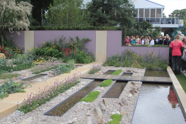
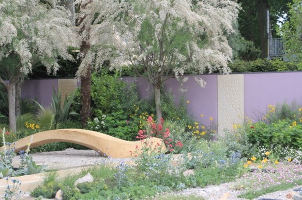
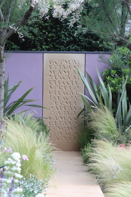
In 2011 Robert Myers, the landscape architect and designer of the cancer Research Garden UK garden, commissioned me to design and carve 3 lettered panels for the back wall on the theme of ‘surviving – a celebration of life. On the list of perfect commissions this one scored a ten. Having been told the material: Spanish sandstone, the size of the stones: 1750,1650 and 1550 by 600mm, and the overall design concept of the garden, I was asked to suggest the words and come up with some designs.
I remembered a poem by a Dutch poet and hematologist called Leo Vroman who lived most of his life in America. Despite this the majority of his poetry is written in Dutch, and indeed my first ‘public speaking’ session was at secondary school in Holland talking about one of his poems in front of the class. When I looked it up it seemed very apt (and happened to be written in English): Part from ‘On the other hand’:

But sometimes I sense my own molecules freed blown like winterseed along the immense curlings of space the way a tree with all its leaves gone

is rid of its dark and will suddenly see the sunshine on its new-bared bark and is at long last blissfully blinded and fully reminded of its past.
What appears in such light as near the end turns out as a mere branch or a bend a beginning.
I very much wanted to have a feeling of foliage and pattern to the pieces and the ability to live with them as abstract sculpture as well as lettering, and above all it had to be simple and large enough to see from beyond the ropes that cordon the gardens at Chelsea. In February I went with Robert to a meeting at the Cancer Research headquarters in the Angel in and showed 2 alternative designs. We talked about them and a decision was made there and then. This left plenty of time to do the full size drawings and the 3/4 weeks carving I envisaged. To get his approval I contacted Leo Vroman by email – 93 at the time and still very much here his wonderful response was: “fantastic, what a job, I feel very responsible and wish I could have said it shorter – so you would only have to carve one smallish stone!”
The chosen design was much influenced by a card hanging on my wall of pen lettering by Lieve Cornil, and I am very grateful to her for allowing me to use her shapes as inspiration.
The first draft of the lettering showed the text from right to left, the direction of entering the garden. After much soul searching both Robert and I thought this was not really sensible as we naturally read from left to right. We also decided that each stone had to start and finish on a word rather than any old letter. This made for a complete redesign. I scanned the alphabet into the computer and then laid each stone out in photoshop, a layer per letter so I could move them around singly. It worked, but slowly. I then printed the design at full size and redrew it all onto typo detail paper.
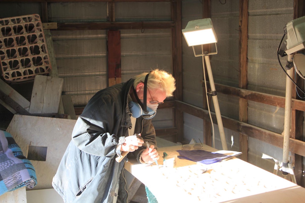
The stones were delivered to St. Aldhelm’s quarry in Purbeck where I spent a lovely 3 weeks carving - fully masked!

