In 2004 and 2005 the National Gallery was undergoing building and refurbishment work. Incisive Letterwork was awarded the contract to design and carve the lettering for the project.
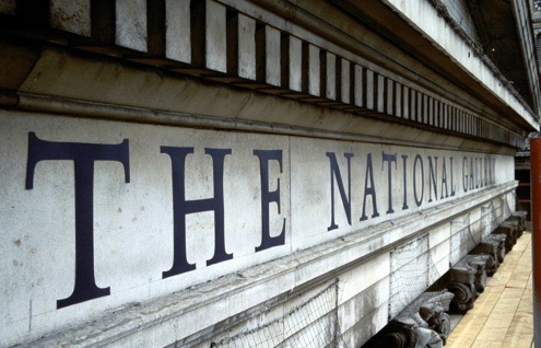
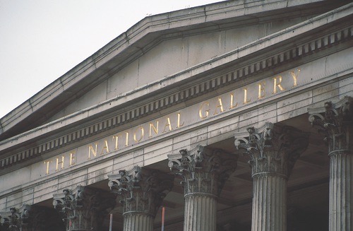
The National Gallery’s house style, used for signage and graphics is Bembo and we were asked to use this as a starting point for our design. Faced with this task we referred back to the original Bembo type designed by Aldus Manutius and cut by Francesco Griffo in the 1490’s. The challenge was to design letters which would look good as large cut forms, for instance along the frieze of the portico, but also at a much smaller and massed scale as on the donor plaques for the entrance hall. The width of the original face was retained in the new design but the thins were thickened and the serifs turned into small slab serifs. As the lettering is asked to do a variety of different jobs we designed 3 related versions of the basic alphabet. The widest and largest version is used in the newly carved name on the portico above the main entrance. The proportion of the frieze, long and narrow, means that the letters need to be fairly wide and widely spaced. The letter height could only be 400mm yet the words THE NATIONAL GALLERY needed to fill a substantial part of the 18 metre long portico.
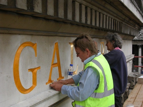
Why was the name not carved when the building was originally erected? The most likely explanation is that it was built to house both The Royal Academy and The National Gallery. The carving and gilding took 3 weeks. Brenda Berman and Annet Stirling were assisted on this part of the project by Exeter based lettercutter and sundial specialist Ben Jones.
The main entrance hall features plaques, 24 Portland stone slabs in all, carved with the names of donors to the Gallery from the years 1826 to 2002. We designed a narrower version of the Bembo face for these. Legibility required the largest cap height possible for the letters and a height of 33mm was made possible by narrowing the original design. This also had the effect of making the mass of lettering into a pleasing yet readable abstract pattern. All the people who helped with this part are mentioned below.
For the Getty entrance and the Annenberg Court we used the letter width most closely related to Manutius’s original typeface. The six inch letters for the Getty Entrance are carved straight into the existing Portland stone and then gilded.
The Annenberg Court inscription above the staircase was carved in Bath stone and then cast in plaster by Simplicity Plaster Casters. The letters are 295mm high.
The job architect was Nigel Bailey from Dixon Jones.
We would like to thank: Anthony Caro who kindly lent us his studio to draw all the lettering onto the donor stones, Brian Bugler, Dave Burt and Andy Webster at Haysom’s Quarry who helped in the early stages of the project and Mike Jenkins, Ben Jones, Una Sullivan, Caroline Webb and all at Eric Marland’s studio who helped to carve these stones. We especially like to thank Roger Francis from Francis and Buchanan Ltd who has moved the stones and advised and helped at all stages and put the finishing touches to them on site.


